Between 2024 and 2026, Bento-style portfolio templates on Webflow and Framer grew by 240%.
The numbers behind the Bento Grid experience boost: time-on-page up 47%; click-through conversion up 38%.
Origins: from bento boxes to Apple keynotes
The Bento Grid takes its name from the Japanese lunchbox — one tray, many compartments, each holding its own thing, no overlap, scannable at a glance. The analogy turns out to be uncannily accurate.
- 2010: Microsoft’s Metro Design Language brings tiled UI into the mainstream for the first time (Windows Phone 7 → Xbox → Office)
- 2022: Apple starts using Bento-style cards extensively on product pages and in keynotes to display hardware specs; Google follows soon after
- 2023: Linear, Vercel, Loom and other SaaS products bring Bento to landing pages, making it the default visual language for AI startups
- 2025+: The Active Grid era — cells start to move, supporting interaction, live data, and AI-driven auto-layout
Design characteristics
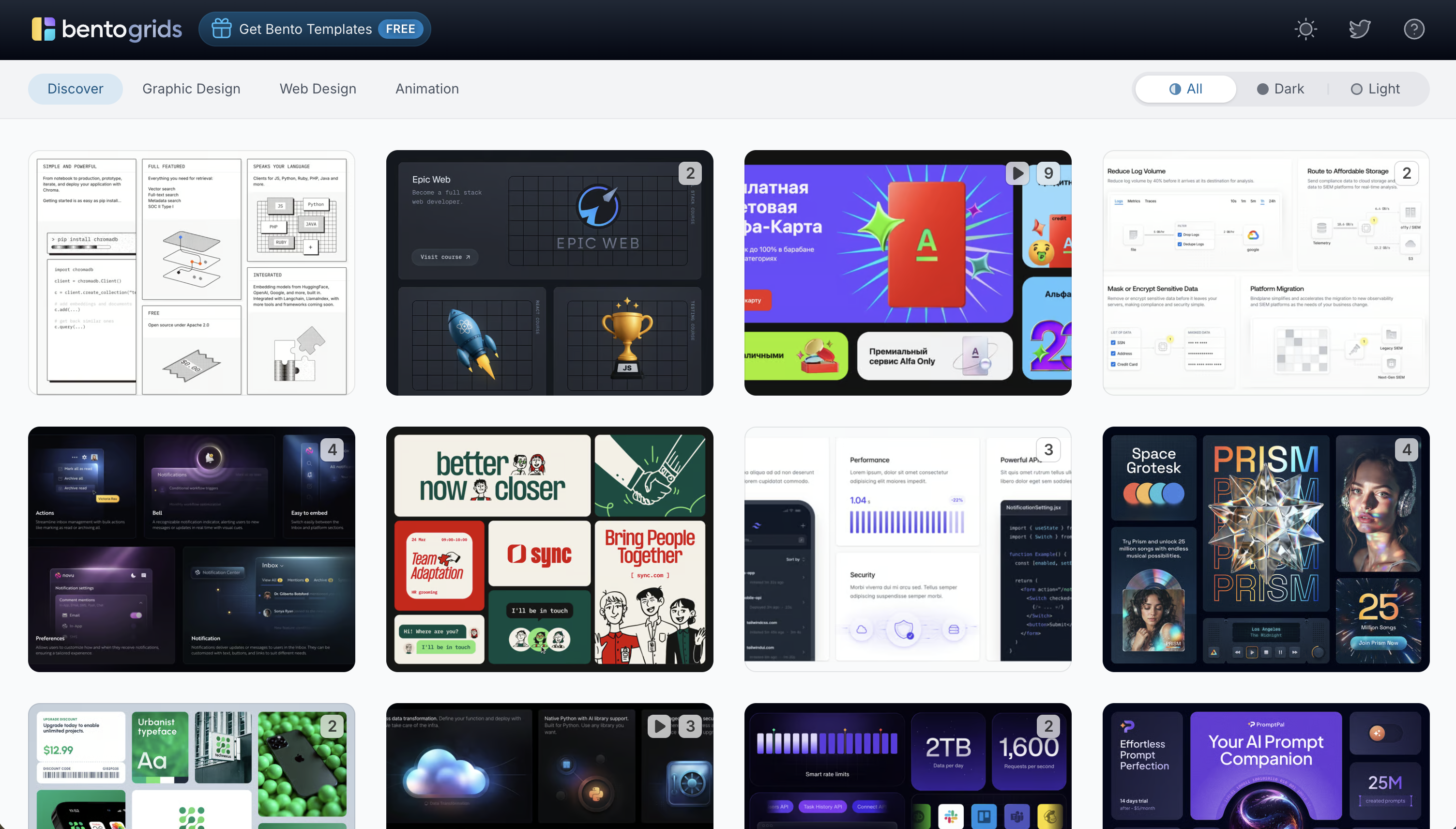
Bento Grid is fundamentally different from an ordinary masonry grid (like Pinterest’s waterfall layout):
- Strict, geometric, hierarchical: each piece of content lives in its own cell
- Important features occupy large 2×2 blocks; secondary information sits in small 1×1 cells
- Uniform spacing, consistent corner radius throughout (typically 12–20px, for a sense of approachability)
Use cases
- Product landing pages: feature matrices
- Dashboards: KPI cards, charts, and status side by side
- Creator portfolios: cross-media showcases without linear navigation
- Personal bio pages: e.g., Linktree
- Blog / media covers: columns laid out side by side with clear hierarchy
Classic examples
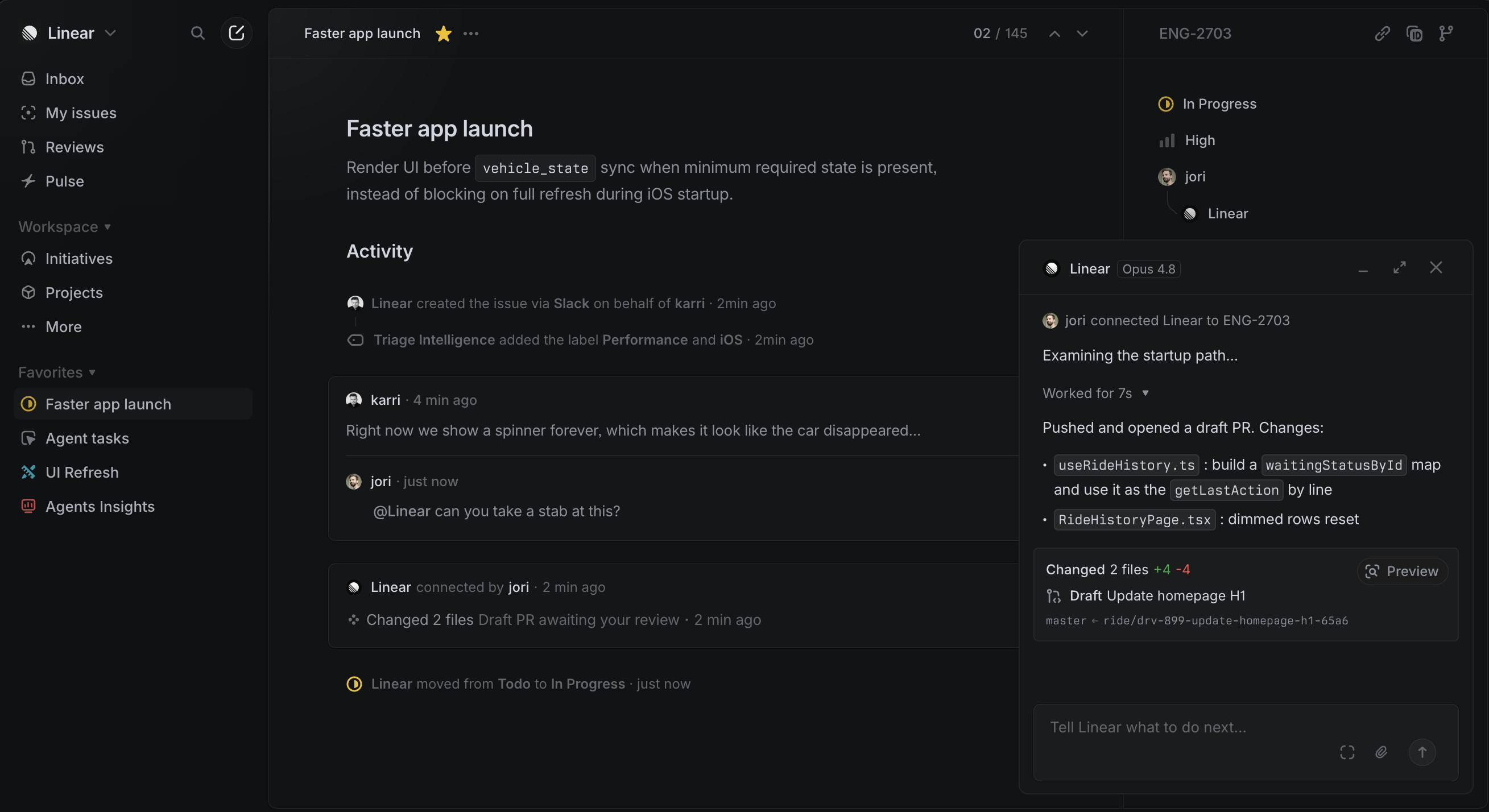
Apple product pages, Linear, Notion, Perplexity, ElevenLabs, Datadog
Directions for design innovation
- Active Grid: make the cells move. Hover-to-expand, video fills, live-refreshing data. The grid stops being a container and starts being the interface’s breathing.
- Breaking the grid: break the rectangular boundary. Elements that spill past their cell, images that span across cells — creating visual tension without losing order.
- Emotional color temperature: different cells carry different moods, using color temperature rather than size alone to signal content importance.
- User-rearrangeable grids: like an iPhone home screen of widgets — let users drag and customize.
- Soft brutalism mixed in: rough textures and imperfect typography inside Bento’s order, breaking the distance created by being “too polished.”
Using AI to execute this style well
Figma’s official prompting framework: the TC-EBC scenario.
- Task: what am I generating — “a Bento Grid section for a feature-showcase landing page”
- Context: what’s the product, who’s the target user, where will this be used
- Elements: how many cells, what goes in each, which cell is the hero
- Behavior: hover effects, animation, responsiveness
- Constraints: tech stack, color tokens, fonts, corner-radius values
Common mistakes:
- Too vague: “Design a premium-feeling Bento” → “Reference Linear.app’s dark-mode Bento Grid, primary color #0F0F0F, card border #1F1F1F”
- No hierarchy: “Add 6 feature blurbs” → “The hero feature spans grid-column: span 2; the other 5 each span 1”
- No constraints: “Build it in CSS” → “grid-template-columns: repeat(4,1fr), gap: 12px, border-radius: 16px”
- No mood: “Modern feel” → “Calm, restrained, generous whitespace, no decorative elements — like Notion’s homepage”
- Asking for everything at once: “Build the whole page for me” → generate the color palette first, then the grid skeleton, then fill in content — three passes
Design tokens
- Columns:
repeat(4, 1fr) - Spacing:
gap: 10–16px - Corner radius:
12–20px, consistent globally - Hero cell:
span 2 / span 2 - Wide horizontal cell:
span 2 / span 1 - Standard cell:
span 1 / span 1 - Padding:
20–28px - Type hierarchy: headline 18px / body 13px
A ready-to-use prompt template
# Goal
Design a Bento Grid feature-showcase section for [product name].

# Layout
- 4-column CSS Grid, gap: 12px
- Hero feature "[feature name]" spans 2 × 2
- The remaining [N] features each span 1×1 or 2×1
- border-radius: 16px, consistent throughout

# Visual style
- Reference [Linear.app / Apple product pages / Notion homepage]
- Background color [#HEX], card color [#HEX], accent color [#HEX]
- Font: [SF Pro / Inter / system-ui]
- No decorative elements, generous whitespace

# Constraints
- HTML + CSS only, no dependencies
- Responsive: single column on mobile
- On hover, cells lift slightly (translateY -2px)