The hardest design is one where, after everything has been removed, what remains still feels complete.
Origin
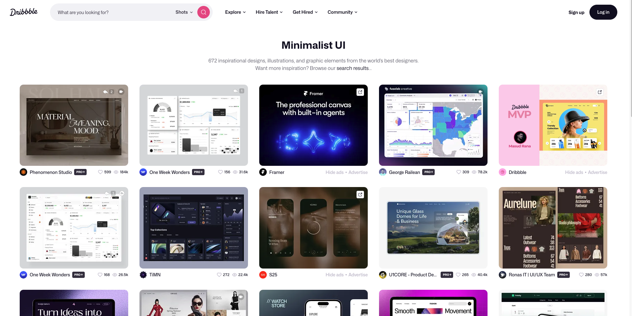
“Less is more” isn’t a design slogan — it’s an architect’s manifesto.
Minimalism took shape first in art and architecture, then moved into screens. Mies van der Rohe used “less is more” to describe his glass buildings stripped down to pure structure. Dieter Rams at Braun established the principle “good design is as little design as possible” (Less, but better). Japan’s MUJI turned it into an entire “no-brand” philosophy — objects serve function first, and aesthetics are a byproduct of function, not an addition. The digital era inherited exactly this DNA.
| Year | Milestone |
|---|---|
| 1947 | Mies van der Rohe establishes “Less is more” as a modernist architectural creed |
| 1970s | Dieter Rams’s ten principles of good design define product minimalism |
| 2008+ | Apple and Google bring flat design and generous whitespace into mainstream digital interfaces |
| 2026 | Warm / Neo-Minimalism: minimalism grows texture, emotion, and warmth |
Design Anatomy
Minimalism isn’t “fewer things” — it’s “everything that remains has earned its place.”
There’s really only one test: if you remove one more element, does the design lose something essential? If yes, you’ve reached the minimum necessary form. The five principles below are how this test plays out in interface design.
01 Whitespace is structure. Empty space isn’t unfilled area — it’s room to breathe. It creates hierarchy and focuses attention. When in doubt, add 20% more.
02 Typography becomes the protagonist. When elements are reduced, layout carries the expression. One or two typefaces with a clear size hierarchy become the visual body of the interface itself.
03 A single accent color. Neutral tones as the base, with one accent color reserved for the most important action. Stripe uses a single #635BFF across its entire site — everything else is black, white, or gray.
04 Three to four levels of hierarchy. Use size, color, and spacing to guide the eye. Beyond four levels, clarity starts curdling into confusion.
05 Color communicates state. Color is for distinguishing “active / disabled,” “primary / secondary” — not for decoration. Every color choice has to earn its place.
A counterexample: deleting elements until the interface becomes confusing isn’t minimalism — it’s emptiness. Emptiness has no personality, because the things that carry personality were deleted along with everything else.
Where It Works
The more a product demands focus, the more minimalism helps.
It’s the default visual language for reading products, tools, and transaction flows. Linear, Notion, Arc, and Stripe all turned “an interface that almost disappears” into multi-billion-dollar products — Stripe’s checkout flow is legendary precisely for its simplicity.
The functional argument is harder than the aesthetic one: interfaces with fewer elements, clearer roles, and more generous whitespace produce measurably lower cognitive load, faster task completion, and lower error rates.
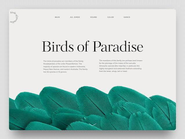
What’s Next in 2026
After AI made “imitation” essentially free, minimalism is growing a soul.
After years of visual overload, designers are pulling back — but this time, not toward the rigid, lifeless minimalism of the past. Trend forecasters are calling it Warm Minimalism or Neo-Minimalism: the clean skeleton stays, but texture, warmth, and a hint of human imperfection return. Color palettes shift from pure black and white toward “grounded earth tones” — sage green, cement gray, lavender, warm gray, caramel. Micro-animations and soft feedback cues (a gentle tap, a soft completion sound) restore a sense of emotional presence to quiet interfaces.
If old-school minimalism was “Less is more,” then the 2026 version is Less, but meaningful — not just subtracting, but crafting what remains with greater care.